What Is CSS and How Do You Use It?
You have already built real HTML pages. They have structure, meaning, and content. But they look plain — black text on a white background, no colour, no layout, no personality. CSS is what changes that. Before writing a single rule, you need to know what CSS actually is and the three ways it connects to your HTML.
① What Is CSS?
CSS stands for Cascading Style Sheets. It is the language that controls how HTML elements look on screen — their colour, size, spacing, layout, font, animation, and more.
Think of it this way: if your HTML page is a building, HTML is the concrete and steel structure — walls, floors, doors. CSS is the paint, the furniture, the lighting, and the interior design. The structure does not change, but the CSS transforms how it looks and feels completely.
CSS works by selecting an HTML element and then declaring how it should look. Every CSS rule has the same shape:
selector {
  property: value;
}

/* Real example — make every paragraph dark grey and easy to read */
p {
  color: #444;
  font-size: 16px;
  line-height: 1.7;
}
| Part | What it is |
|---|---|
| selector | Tells the browser which HTML element to target. Here p targets every paragraph on the page. You will learn all types of selectors in Chapter 01. |
| property | The visual attribute you want to control — color, font-size, background, margin, and hundreds more. |
| value | The specific setting for that property — a colour, a size, a keyword like bold or center. |
| { } curly braces | Wrap all the declarations for that selector. You can have as many property: value pairs inside as you need. |
| ; semicolon | Ends every declaration. Missing a semicolon is one of the most common beginner mistakes — it causes every rule after it to break silently. |
The word Cascading in CSS describes what happens when multiple rules target the same element — the browser follows a specific priority system to decide which rule wins. You will master this in Chapter 01 under Specificity.
② Three Ways to Add CSS to Your HTML
There are exactly three ways to connect CSS to an HTML page. You will see all three in the wild. They work differently, have different use cases, and one is clearly the right choice for real projects.
<!-- CSS is written directly in the style="" attribute on a single tag -->
<h1 style="color: #7c6af7; font-size: 48px; font-weight: 800;">
  AngelCode Labs
</h1>

<p style="color: #888; font-size: 16px; line-height: 1.7;">
  Learn HTML, CSS, JavaScript, PHP and SQL.
</p>

<a href="/enrol" style="background: #7c6af7; color: #fff; padding: 12px 24px;
   border-radius: 6px; text-decoration: none;">Enrol Now</a>
Inline styles work, but they are the worst way to use CSS. Every element needs its own copy of the styles — if you have 50 paragraphs, you have to write the same style on all 50 tags. Changing one colour means editing 50 places. They also have very high specificity, which causes confusing bugs later. Use inline styles only for quick tests or JavaScript-driven style changes.
<!-- From HTML Ch1: the page skeleton — now with CSS inside <head> -->
<!DOCTYPE html>
<html lang="en">
<head>
  <meta charset="UTF-8">
  <meta name="viewport" content="width=device-width, initial-scale=1.0">
  <title>AngelCode Labs</title>

  <!-- ✓ CSS lives here, inside a <style> block in <head> -->
  <style>
    body  { font-family: sans-serif; background: #0a0a0f; color: #e8e8f0; }
    h1    { color: #7c6af7; font-size: 48px; }
    p     { color: #888; line-height: 1.7; }
    .btn  { background: #7c6af7; color: #fff; padding: 12px 24px; border-radius: 6px; }
  </style>
</head>
<body>
  <h1>AngelCode Labs</h1>
  <p>Learn HTML, CSS, JavaScript, PHP and SQL.</p>
  <a href="/enrol" class="btn">Enrol Now</a>
</body>
</html>
The <style> block sits inside <head> — before the body content. This is much better than inline styles: you write your CSS once and it applies to every matching element on the page. Changing h1 { color: red } updates every h1 at once. It is the right choice for practising in the playground throughout this course — and for tiny single-page projects. For anything bigger, use Method 3.
<!-- File 1: index.html — CSS is linked, not written here -->
<!DOCTYPE html>
<html lang="en">
<head>
  <meta charset="UTF-8">
  <meta name="viewport" content="width=device-width, initial-scale=1.0">
  <title>AngelCode Labs</title>

  <!-- ✓ Link to an external .css file — this is the professional approach -->
  <!-- Must go in <head>, before <body>, so styles load before content renders -->
  <link rel="stylesheet" href="styles.css">

</head>
<body>
  <h1>AngelCode Labs</h1>
  <p>Learn HTML, CSS, JavaScript, PHP and SQL.</p>
  <a href="/enrol" class="btn">Enrol Now</a>
</body>
</html>


/* ─────────────────────────────────────────────────────────────────────────
   File 2: styles.css — a completely separate file in the same folder
   ───────────────────────────────────────────────────────────────────────── */

body  { font-family: sans-serif; background: #0a0a0f; color: #e8e8f0; }
h1    { color: #7c6af7; font-size: 48px; }
p     { color: #888; line-height: 1.7; }
.btn  { background: #7c6af7; color: #fff; padding: 12px 24px; border-radius: 6px; }
One .css file styles every page on your site. Your about page, your courses page, your contact page — all link to the same styles.css. Changing a button colour in one file updates every button everywhere instantly. The browser also caches the CSS file after the first load, making every other page faster. This is how every professional website is built.
③ Side-by-Side Comparison
| Method | Where the CSS lives | Scope | Use it when… |
|---|---|---|---|
Inline style="" |
Inside the HTML tag itself | One element only | Quick debugging, or JavaScript needs to change a style dynamically at runtime. |
Internal <style> |
Inside <head> of the HTML file |
One page only | Practising and learning (like this course's playground), or a genuinely single-page project. |
External .css file |
A separate styles.css file linked via <link> |
Every page on your site | Every real project. One change updates the entire site. The browser caches the file for speed. |
④ Where Exactly Does the <link> Tag Go?
This is a question every beginner asks. The answer is precise: the <link> tag must go inside <head>, before the closing </head> tag. Never put it in <body>.
The reason is the order in which a browser builds a page. It reads the HTML file from top to bottom. When it hits your <link> tag, it immediately starts downloading the CSS file in the background. By the time it finishes reading the body and starts painting elements on screen, the CSS is already loaded — so elements appear styled from the first moment.
If you place <link> at the bottom of <body>, the browser paints the unstyled HTML first — the user briefly sees black text on a white page — then the CSS loads and re-paints everything. This is called a Flash of Unstyled Content (FOUC) and it looks broken.
<!DOCTYPE html>
<html lang="en">
<head>                                           <!-- ① Everything in head runs first -->
  <meta charset="UTF-8">
  <meta name="viewport" content="width=device-width, initial-scale=1.0">
  <title>AngelCode Labs — Web Courses</title>

  <link rel="preconnect" href="https://fonts.googleapis.com"> <!-- ② Font preconnect -->
  <link rel="stylesheet" href="styles.css">             <!-- ③ CSS goes HERE ✓ -->

  <script src="app.js" defer></script>                   <!-- ④ JS with defer — does not block -->
</head>
<body>                                           <!-- ⑤ Body content renders after CSS is ready -->

  <header>
    <nav aria-label="Main navigation">
      <ul>
        <li><a href="/">Home</a></li>
        <li><a href="/courses">Courses</a></li>
        <li><a href="/contact">Contact</a></li>
      </ul>
    </nav>
  </header>

  <main id="main-content">
    <h1>Web Development Courses in Ghana</h1>
    <p>Learn HTML, CSS, JavaScript, PHP and SQL.</p>
    <a href="/enrol" class="btn">Enrol Now</a>
  </main>

  <footer>
    <p>© 2026 AngelCode Labs · <a href="/privacy">Privacy Policy</a></p>
  </footer>

</body>
</html>
| Position in file | What it does and why it matters |
|---|---|
| ① <head> runs first | Everything inside <head> is processed before the browser paints anything on screen. This is why CSS belongs here — it is ready before content appears. |
| ② Font preconnect | From HTML Ch2 — opens a network connection to Google Fonts early so the font file downloads faster. Always placed before the stylesheet link. |
| ③ <link rel="stylesheet"> | The CSS link. The rel="stylesheet" tells the browser what kind of file this is. The href is the path to the file — relative to the HTML file's location. |
| ④ script defer | From HTML Ch12 — JavaScript loads in the background and runs after the DOM is ready. Defer means JS never blocks CSS or HTML from rendering. |
| ⑤ <body> renders last | By the time the browser starts painting h1, nav, and main on screen, styles.css is already downloaded and parsed. Elements appear styled from the very first frame — no FOUC. |
| href="styles.css" | A relative path — the browser looks for styles.css in the same folder as the HTML file. If your CSS is in a folder: href="css/styles.css". If it is one folder up: href="../styles.css". |
Throughout this course the playground uses the internal <style> approach — paste the HTML in the editor, add a <style> block above it, then paste the CSS inside. This keeps everything in one file so you can try each concept instantly. When you build your real project after the course, switch to an external styles.css file linked from your HTML.
Create a folder called angelcode-project/ and put two files inside it: index.html (the HTML from the HTML course) and styles.css (empty for now). Add <link rel="stylesheet" href="styles.css"> inside the <head> of your HTML file. Every CSS rule you learn in this course goes into styles.css — open index.html in the browser and refresh to see your changes live.
Selectors & Specificity
Before styling anything you must tell the browser which HTML elements to target. Selectors do that. When two rules conflict, specificity decides which wins. Mastering both eliminates hours of debugging.
① Explanation
A CSS selector is the first part of a CSS rule — it identifies the elements you want to style. There are three selector types you will use daily:
- Element — targets every tag of that type:
p { }targets all paragraphs - Class — targets elements with a specific class:
.card { } - ID — targets one unique element:
#header { }
Specificity is a scoring system. When two rules target the same element, the rule with the higher score wins — regardless of order. IDs beat classes, classes beat elements. Inline styles beat everything. Understanding this is the difference between CSS that works and CSS that mysteriously "breaks".
② Code Example
<!-- This is the AngelCode Labs page from the HTML course. Now add CSS below in a <style> tag to see each selector in action. --> <!-- Element selector: p { } targets every paragraph --> <p>Learn HTML, CSS, JavaScript, PHP and SQL at AngelCode Labs.</p> <!-- Class selector: .card { } targets every element with class="card" --> <div class="card">HTML & SEO Mastery — Course Card</div> <div class="card">CSS Mastery — Course Card</div> <!-- ID selector: #site-header { } targets this one unique element --> <div id="site-header">AngelCode Labs — Site Header</div> <!-- Descendant combinator: nav a { } — any <a> inside <nav> --> <!-- Direct child combinator: ul > li { } — only immediate <li> children --> <nav> <ul> <li><a href="/">Home</a></li> <li><a href="/courses">Courses</a></li> <li><a href="/about">About</a></li> <li><a href="/contact">Contact</a></li> </ul> </nav> <!-- Adjacent sibling: h2 + p — first paragraph after the heading --> <h2>How to Set Up Your First Website</h2> <p class="intro">This paragraph immediately follows the h2 — h2 + p targets it.</p> <p>These sibling paragraphs are targeted by h2 ~ p.</p> <!-- Attribute selectors: from HTML ch5 (Links & Media) --> <input type="email" placeholder="you@example.com"> <a href="https://github.com/angelcode" target="_blank" rel="noopener noreferrer"> View our GitHub portfolio </a> <a href="course-notes.pdf">Download course notes (PDF)</a> <!-- Specificity battle: #hero .intro p wins (score 0,1,1,1) --> <div id="hero"> <p class="intro">Green wins — ID + class + element beats class + element.</p> </div>
/* Element selector — targets every <p> */
p { color: #888; line-height: 1.7; }

/* Class selector — reusable, targets class="card" */
.card { background: #16161f; border-radius: 8px; padding: 24px; }

/* ID selector — unique element only */
#site-header { position: sticky; top: 0; }

/* Combinators */
nav a      { color: #888; }       /* any <a> inside <nav> */
ul > li    { list-style: none; }  /* direct <li> children only */
h2 + p     { font-size: 1.1em; }  /* <p> immediately after <h2> */
h2 ~ p     { color: #aaa; }       /* all <p> siblings after <h2> */

/* Attribute selectors */
input[type="email"] { border-color: #7c6af7; }
a[href^="https"]    { color: #5af7c0; }   /* starts with https */
a[href$=".pdf"]     { font-weight: bold; }   /* ends with .pdf */

/* Specificity battle — who wins? */
p               { color: gray; }    /* 0,0,0,1 — loses */
.intro          { color: blue; }    /* 0,0,1,0 — wins over element */
#hero .intro p  { color: green; }   /* 0,1,1,1 — wins overall */
③ Code Explanation
| Selector | What it means and when to use it |
|---|---|
| p { } | Targets every <p> tag on the page. Good for global defaults. Be careful — it affects all paragraphs everywhere. |
| .card { } | Targets any element with class="card". Classes are the preferred selector for almost everything — reusable and specific enough without being over-specific. |
| #site-header { } | Targets the one element with id="site-header". IDs have very high specificity which causes problems — use classes for styling, reserve IDs for JS hooks and anchor links. |
| nav a { } | Descendant combinator — targets any <a> inside <nav>, no matter how deeply nested. The most common combinator, perfect for navigation links without affecting all links on the page. |
| ul > li { } | Direct child combinator. Targets only <li> elements that are immediate children of <ul>, not nested list items. Use when you need to style only the top level of a structure. |
| h2 + p { } | Adjacent sibling — the <p> must immediately follow the <h2> with nothing between them. Classic use: making the first paragraph after a heading slightly larger as a lead-in. |
| input[type="email"] | Attribute selectors style elements by their HTML attributes. Eliminates the need to add extra classes to every input — target by what the element already is. |
| Specificity (0,1,1,1) | The score format is (inline, IDs, classes/attrs/pseudos, elements). #id = 100pts, .class = 10pts, element = 1pt. A rule with score 0,1,1,1 always beats 0,0,2,3 — IDs dominate regardless of how many classes the other rule has. |
④ What You Will See
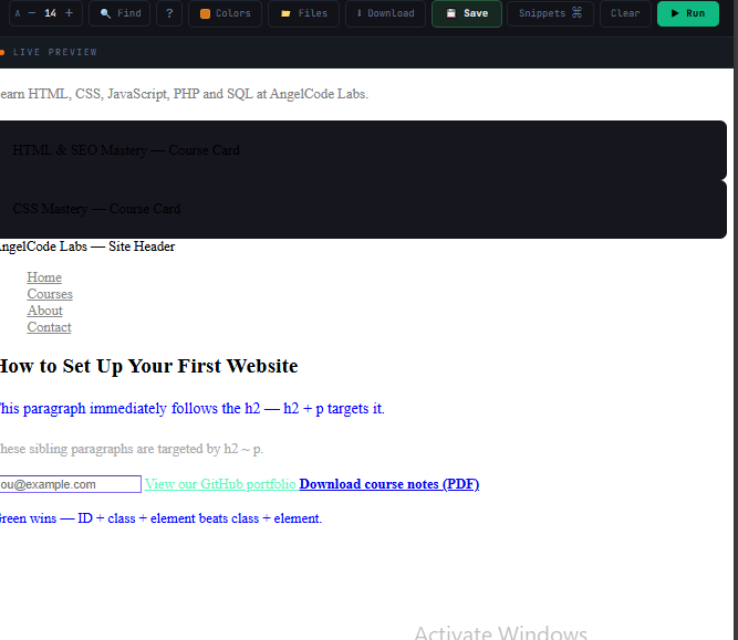
!important starts a specificity war that makes CSS impossible to maintain. Fix specificity by restructuring selectors — never by escalating to !important. Reserve it only for utility overrides in design systems.
The Box Model
Every HTML element is a rectangular box. The box model defines its four layers — content, padding, border, and margin. Understanding it is what stops layouts from being 4px wider than you expected.
① Explanation
Every element on screen is a box made of four layers, from inside out: content (the text or image), padding (space inside the border), border (the visible edge), and margin (space outside, pushing neighbours away).
The critical problem: by default, setting width: 300px sizes only the content. The browser then adds padding and border on top — making your element wider than 300px. One line fixes this for the entire project.
② Code Example
<!-- The .card element from the HTML course (ch8 article cards). Apply box-sizing: border-box and see how width stays exactly 300px. --> <!-- A course card: 300px wide, padding, border, border-radius, margin --> <div class="card"> <img src="course-html.webp" alt="HTML & SEO Mastery course thumbnail" width="300" height="160" loading="lazy"> <div class="card-body"> <h3>HTML & SEO Mastery</h3> <p>12 chapters · Beginner friendly · SEO built-in</p> <a href="/courses/html" class="btn">Start Learning</a> </div> </div> <!-- display: block — the card itself is block-level, takes full row --> <!-- display: inline — used for the <strong> tag inside text --> <p> Courses available: <strong>HTML</strong>, <strong>CSS</strong>, <strong>JavaScript</strong>, <strong>PHP</strong>, <strong>SQL</strong>. </p> <!-- display: inline-block — badge pills sitting in a line with padding --> <span class="badge">12 Chapters</span> <span class="badge">Beginner Friendly</span> <span class="badge">SEO Built-In</span> <!-- overflow: hidden — clips the course thumbnail to the card's border-radius --> <div class="card" style="max-width:300px;"> <div style="overflow:hidden; border-radius:6px;"> <img src="course-css.webp" alt="CSS Mastery course thumbnail" width="300" height="160" loading="lazy"> </div> <p style="padding:12px 0 0;">CSS Mastery Course</p> </div>
/* ── The universal fix — always include ── */
*, *::before, *::after { box-sizing: border-box; }
/* Now width includes padding+border — no more surprises */

/* ── Box model properties ── */
.card {
  width: 300px;
  padding: 24px;               /* all sides */
  padding: 12px 24px;          /* top+bottom | left+right */
  border: 2px solid #2a2a3a;
  margin: 16px;                /* pushes neighbours away */
  border-radius: 8px;
}

/* ── Display types ── */
.block        { display: block; }        /* full width, stacks vertically */
.inline       { display: inline; }       /* flows in text — no width/height */
.inline-block { display: inline-block; } /* inline + respects w/h/margin */
.hidden       { display: none; }         /* removed from layout entirely */

/* ── Overflow ── */
.box {
  overflow: hidden;   /* clips — enables border-radius on images */
  overflow: auto;     /* scroll only when needed ✓ */
  overflow-x: auto;  /* horizontal scroll only */
}
③ Code Explanation
| Property | What it does |
|---|---|
| box-sizing: border-box | The most important CSS habit. Makes width and height include padding and border. Without it, a 300px element with 24px padding is actually 348px wide. Apply globally with the * selector. |
| padding: 12px 24px | Two-value shorthand: first value = top and bottom, second = left and right. Padding is inside the border, has the element's background colour, and is included in the clickable area. |
| margin: 16px | Space outside the element. Transparent — shows the parent's background. Vertical margins between block elements collapse — the larger value wins, they do not add. |
| border-radius: 8px | Rounds corners. 50% on a square element makes a circle. Works with overflow: hidden to clip images into rounded shapes. |
| display: block | Full available width, stacks vertically. Supports width, height, and all margins. Headings, divs, sections are block by default. |
| display: inline | Sits within text flow. Cannot set width, height, or top/bottom margins. Spans, links, strong are inline by default. |
| display: inline-block | Sits in text flow like inline, but respects all box model properties. Perfect for nav items and buttons that need to stay in line but have padding. |
| overflow: auto | Adds a scrollbar only when content overflows. The most useful overflow setting — use instead of hidden when content might be cut off and scrolling would be helpful. |
④ What You Will See
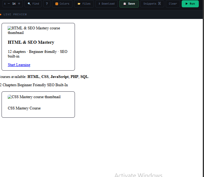
Typography
Typography controls every aspect of text — font, size, weight, spacing, and alignment. Good typography is the single biggest difference between an amateur design and a professional one.
① Explanation
CSS typography is built on a few critical decisions. Font family — always provide a fallback stack. Font size in rem — scales with the user's browser settings and is therefore accessible. Unitless line-height — multiplies with font size, always stays proportional. clamp() — creates fluid sizes that respond to viewport width without media queries.
② Code Example
<!-- The heading hierarchy and article structure from the HTML course. Add the typography CSS in a <style> tag to see fluid sizing, gradient text, truncation, and rem units in action. --> <!-- h1 with clamp(): from HTML ch12 — the AngelCode page primary keyword --> <h1>Web Development Courses in Ghana</h1> <!-- Subtitle paragraph in rem units --> <p> Learn HTML, CSS, JavaScript, PHP and SQL at AngelCode Labs. A complete beginner-to-advanced curriculum with live playground exercises. </p> <!-- Uppercase monospace label — same style used in course badges --> <p class="label">AngelCode Labs · Accra, Ghana</p> <!-- Single-line truncation: course title that might be too long --> <p class="truncate" style="max-width:320px;"> HTML Mastery & Built-In SEO — Chapter 8: Semantic Layout Elements Explained </p> <!-- Gradient text: applied to the site brand name or course titles --> <h2 class="gradient-text">CSS Mastery Course</h2> <!-- Article typography from HTML ch8: "How to Learn HTML in 30 Days" --> <article style="max-width:640px; margin-top:32px;"> <h1>How to Learn HTML in 30 Days</h1> <p>By <strong>Obed Angel</strong> · <time datetime="2025-01-15">January 15, 2025</time></p> <h2>Week 1: The Basics</h2> <p>Start with document structure, text tags, and links. Build your first real page.</p> <h2>Week 2: Forms and Tables</h2> <p>Learn how to collect user input and display data in structured tables.</p> </article>
/* ── Load Google Fonts ── */
@import url('https://fonts.googleapis.com/css2?family=Syne:wght@700;800&family=DM+Sans:wght@400;500&display=swap');

/* ── Base body typography ── */
body {
  font-family: 'DM Sans', -apple-system, sans-serif;
  font-size: 1rem;          /* 16px — use rem, not px */
  font-weight: 400;
  line-height: 1.7;          /* unitless — scales with font-size */
  color: #e8e8f0;
  -webkit-font-smoothing: antialiased;
}

/* ── Fluid headings — no media queries ── */
h1 { font-size: clamp(32px, 6vw, 72px); font-weight: 800; line-height: 1.05; }
h2 { font-size: clamp(24px, 4vw, 40px); font-weight: 700; line-height: 1.2; }
h3 { font-size: clamp(18px, 2.5vw, 24px); font-weight: 600; }

/* ── Monospace label ── */
.label {
  font-family: 'JetBrains Mono', monospace;
  font-size: 0.6875rem;
  letter-spacing: 3px;
  text-transform: uppercase;
}

/* ── Text overflow: truncate with ellipsis ── */
.truncate {
  white-space: nowrap;
  overflow: hidden;
  text-overflow: ellipsis;
}

/* ── Gradient text ── */
.gradient-text {
  background: linear-gradient(135deg, #7c6af7, #5af7c0);
  -webkit-background-clip: text;
  -webkit-text-fill-color: transparent;
  background-clip: text;
}
③ Code Explanation
| Property / Value | What it does |
|---|---|
| font-family stack | Browser uses the first available font. -apple-system uses the OS system font on Apple devices. Always end with a generic family (sans-serif, serif, monospace) as the ultimate fallback. |
| font-size: 1rem | rem is relative to the root element (usually 16px). It respects the user's browser font size preference — critical for accessibility. Always use rem for font sizes, not px. |
| line-height: 1.7 | Unitless multiplies by the current font size automatically. For body text 1.5–1.8 is readable. For headings 1.0–1.2 is tight and correct. Never set line-height in px — it will not scale. |
| clamp(32px, 6vw, 72px) | Creates a fluid range: minimum 32px, maximum 72px, preferred 6% of viewport width. The heading scales smoothly between these bounds as the screen resizes — one property replaces three media query breakpoints. |
| letter-spacing: 3px | Tracks characters apart. Used on uppercase labels and monospace tags. Positive values spread letters, negative compress them. Use em units on body text so it scales. |
| text-overflow: ellipsis | Shows ... for overflowing text. Requires all three: white-space: nowrap (prevents wrapping), overflow: hidden (clips text), text-overflow: ellipsis (adds the dots). All three are mandatory. |
| Gradient text | Applies a gradient as background, then clips the background shape to the text characters. The -webkit- prefix is required. Only works on text with actual characters — not on empty elements. |
④ What You Will See
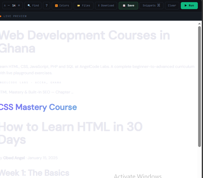
Flexbox
Flexbox arranges elements in a single row or column. It handles navigation bars, card rows, centred content, and any layout where you need to distribute space between elements.
① Explanation
Flexbox works on a parent-child relationship. Set display: flex on the parent — its direct children automatically become flex items. Two axes control everything: the main axis (direction items flow, horizontal by default) and the cross axis (perpendicular). justify-content controls the main axis; align-items controls the cross axis.
② Code Example
<!-- This is the actual AngelCode Labs page structure from HTML ch6 and ch8. Apply the Flexbox CSS in a <style> tag to lay it all out. --> <!-- Navbar: logo left, links centre, Get Started CTA pushed to the right CSS: .nav { display:flex; align-items:center; justify-content:space-between } --> <header> <nav class="nav" aria-label="Main navigation"> <a href="/" class="logo"> <img src="logo.png" alt="AngelCode Labs Home" width="150" height="40"> </a> <ul> <li><a href="/">Home</a></li> <li><a href="/courses">Courses</a></li> <li><a href="/about">About</a></li> <li><a href="/contact">Contact</a></li> </ul> <!-- margin-left:auto pushes this to the far right --> <a href="/enroll" class="btn-cta">Get Started</a> </nav> </header> <!-- Responsive course card row: wraps to next line on small screens CSS: .card-row { display:flex; flex-wrap:wrap; gap:16px } .card { flex: 1 1 280px } --> <main> <div class="card-row"> <div class="card">HTML & SEO Mastery</div> <div class="card">CSS Mastery</div> <div class="card">JavaScript Fundamentals</div> <div class="card featured">PHP & MySQL — featured card, order:-1 moves it first</div> <div class="card">SQL Mastery</div> </div> <!-- Hero section: text centred vertically and horizontally CSS: .hero { display:flex; flex-direction:column; align-items:center; justify-content:center; min-height:100vh } --> <div class="hero"> <h1>Web Development Courses in Ghana</h1> <p>HTML · CSS · JavaScript · PHP · SQL</p> <a href="/courses" class="btn-cta">Browse All Courses</a> </div> <!-- Sidebar layout: fixed 260px sidebar, main content takes the rest CSS: .layout { display:flex; gap:32px } .sidebar { flex: 0 0 260px } .main-content { flex: 1 } --> <div class="layout"> <aside class="sidebar"> <h2>Related Articles</h2> <ul> <li><a href="/css-guide">The Complete CSS Guide</a></li> <li><a href="/seo-basics">SEO for Beginners</a></li> </ul> </aside> <main class="main-content"> <article> <h1>How to Learn HTML in 30 Days</h1> <p>By <strong>Obed Angel</strong> · January 15, 2025</p> <p>Start with document structure, text tags, and links...</p> </article> </main> </div> </main>
/* ── Navbar: logo left, links right ── */
.nav {
  display: flex;
  align-items: center;
  justify-content: space-between;
  gap: 24px;
  height: 64px;
  padding: 0 32px;
}

/* ── Responsive card row ── */
.card-row {
  display: flex;
  flex-wrap: wrap;   /* wrap to next line when no space */
  gap: 16px;
}
.card { flex: 1 1 280px; }  /* grow | shrink | min width */

/* ── Perfect centering ── */
.hero {
  display: flex;
  flex-direction: column;
  align-items: center;
  justify-content: center;
  min-height: 100vh;
}

/* ── Sidebar layout ── */
.layout       { display: flex; gap: 32px; }
.sidebar      { flex: 0 0 260px; }  /* fixed — never grow or shrink */
.main-content { flex: 1; }           /* takes all remaining space */

/* ── Push one item to the far right ── */
.nav .btn-cta { margin-left: auto; }

/* ── Reorder without changing HTML ── */
.featured { order: -1; }  /* moves to front */
③ Code Explanation
| Property / Value | What it does |
|---|---|
| display: flex | Activates flexbox on the container. Its direct children become flex items — they line up in a row by default and respond to all flex properties. |
| align-items: center | Centres items on the cross axis. In row direction this means vertically centred — the one-liner that solves vertical centring in navbars, cards, and hero sections. |
| justify-content: space-between | Distributes items on the main axis. space-between = first item at start, last at end, equal gaps between. Other values: center, space-around, space-evenly, flex-start, flex-end. |
| gap: 16px | Consistent space between flex items. Better than margins because gap only creates space between items, not outside the first or last. Also works in grid. |
| flex-wrap: wrap | By default flex items squeeze to fit one line. wrap allows them to flow to the next line when space runs out — essential for responsive card grids. |
| flex: 1 1 280px | Shorthand for grow shrink basis. The card can grow (1), can shrink (1), starts at 280px minimum. Combined with flex-wrap this creates a responsive grid with no media queries. |
| flex: 0 0 260px | Fixed-width item that never grows or shrinks. The sidebar always stays exactly 260px regardless of screen size. |
| margin-left: auto | Consumes all remaining space as margin, pushing the element to the far end. Classic trick to push a button to the right side of a navbar without changing justify-content. |
④ What You Will See
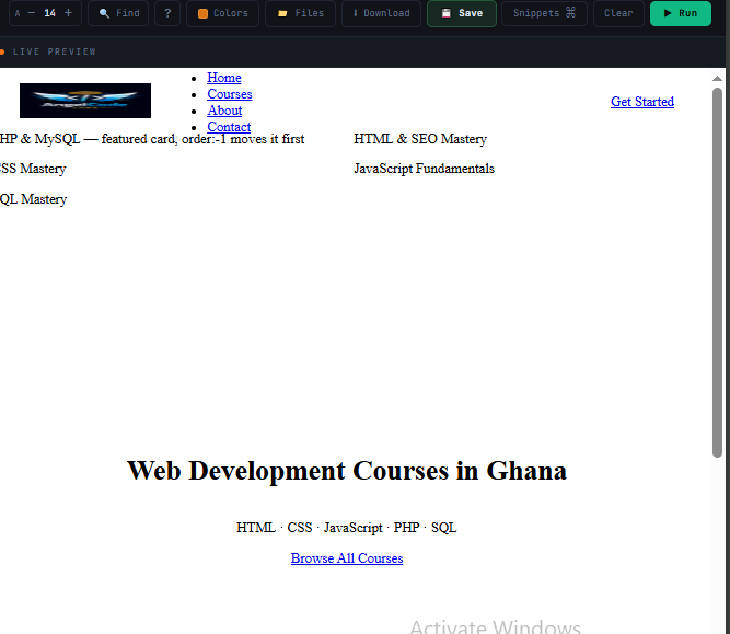
CSS Grid
Grid is two-dimensional — rows and columns simultaneously. Use it for full-page layouts and complex structures where you need precise placement in both directions at once.
① Explanation
Set display: grid on a container and define your columns with grid-template-columns. Items fill cells automatically, or you can place them explicitly. The fr unit divides available space into fractions. Named template areas let you draw your layout as a text map. And repeat(auto-fit, minmax(250px, 1fr)) creates a fully responsive grid with absolutely no media queries.
② Code Example
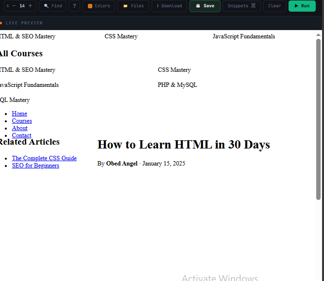
<!-- The course listing grid and page layout from the HTML course. Apply the Grid CSS in a <style> tag. Resize the window to see auto-fit create 1 → 2 → 3 columns with no media queries. --> <!-- 3 equal columns: one row of the courses overview --> <div class="grid"> <div>HTML & SEO Mastery</div> <div>CSS Mastery</div> <div>JavaScript Fundamentals</div> </div> <!-- Responsive auto-fit grid: the full course catalogue From HTML ch6 — HTML & CSS, PHP & SQL, Project Reviews --> <section> <h2>All Courses</h2> <div class="courses-grid"> <div class="course-card">HTML & SEO Mastery</div> <div class="course-card">CSS Mastery</div> <div class="course-card">JavaScript Fundamentals</div> <div class="course-card">PHP & MySQL</div> <div class="course-card">SQL Mastery</div> </div> </section> <!-- Named template areas: the full AngelCode Labs page layout from HTML ch8 grid-template-areas: "header header" / "sidebar main" / "footer footer" --> <div class="page"> <header class="site-header"> <nav aria-label="Main navigation"> <ul> <li><a href="/">Home</a></li> <li><a href="/courses" aria-current="page">Courses</a></li> <li><a href="/about">About</a></li> <li><a href="/contact">Contact</a></li> </ul> </nav> </header> <aside class="sidebar"> <h2>Related Articles</h2> <ul> <li><a href="/css-guide">The Complete CSS Guide</a></li> <li><a href="/seo-basics">SEO for Beginners</a></li> </ul> </aside> <main class="main"> <article> <h1>How to Learn HTML in 30 Days</h1> <p>By <strong>Obed Angel</strong> · January 15, 2025</p> </article> </main> <footer class="site-footer"> <p>© 2026 AngelCode Labs · <a href="/privacy">Privacy Policy</a></p> </footer> </div> <!-- Spanning: featured course spans 2 columns, promo spans all --> <div style="display:grid; grid-template-columns:repeat(3,1fr); gap:16px; margin-top:32px;"> <div class="featured">CSS Mastery (grid-column: span 2)</div> <div>JavaScript Fundamentals</div> <div class="full-width">Pro Plan — ₵5,000/mo · Includes PHP & SQL (grid-column: 1 / -1)</div> <div>PHP & MySQL</div> <div>SQL Mastery</div> </div>
/* ── Three equal columns ── */
.grid { display: grid; grid-template-columns: repeat(3, 1fr); gap: 24px; }

/* ── Responsive grid — no media queries needed ── */
.courses-grid {
  display: grid;
  grid-template-columns: repeat(auto-fit, minmax(280px, 1fr));
  gap: 20px;
}

/* ── Named template areas ── */
.page {
  display: grid;
  grid-template-columns: 260px 1fr;
  grid-template-rows: 64px 1fr 60px;
  grid-template-areas:
    "header  header"
    "sidebar main"
    "footer  footer";
  min-height: 100vh;
}
.site-header { grid-area: header; }
.sidebar     { grid-area: sidebar; }
.main        { grid-area: main; }
.site-footer { grid-area: footer; }

/* ── Spanning across cells ── */
.featured   { grid-column: span 2; grid-row: span 2; }
.full-width  { grid-column: 1 / -1; }  /* spans all columns */

/* ── Centre all cell content ── */
.icon-grid { display: grid; place-items: center; }
③ Code Explanation
| Property / Value | What it does |
|---|---|
| repeat(3, 1fr) | Creates 3 columns of equal width. fr = fraction of available space. All columns share the total width equally. The repeat() function prevents repetition: repeat(4, 1fr) = 1fr 1fr 1fr 1fr. |
| repeat(auto-fit, minmax(280px, 1fr)) | The most powerful responsive pattern in CSS. auto-fit creates as many columns as will fit. Each column is at least 280px and at most 1fr. Result: 1 column on mobile, 2 on tablet, 3+ on desktop — automatically, with zero media queries. |
| grid-template-areas | Defines the layout as a visual text map. Each quoted string is one row. Repeated names merge into one region. A dot (.) is an empty cell. The layout becomes self-documenting — you can read the shape of the page from the CSS. |
| grid-area: header | Assigns the element to the named region. It fills the entire region — no matter how many columns and rows it spans. This is how the header stretches across both columns in the example. |
| grid-column: span 2 | Makes the element occupy 2 column slots. grid-column: 1 / -1 spans from the first column line to the last — a shorthand for full-width regardless of column count. |
| place-items: center | Shorthand for align-items and justify-items in one declaration. Centres content both vertically and horizontally within each grid cell. |
④ What You Will See
Positioning
Positioning breaks elements out of normal document flow. It powers sticky navbars, floating badges, centred modals, and tooltips — things that cannot be achieved with flex or grid alone.
① Explanation
The default position is static — elements stack in the normal flow. Other values let you use top, right, bottom, left. The most important pattern: position: relative on parent, position: absolute on child. The absolute child positions itself relative to the relative parent — not the whole page.
② Code Example
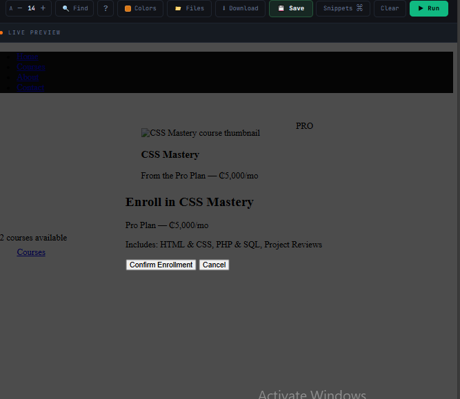
<!-- These are the real elements from the HTML course. Apply the Positioning CSS in a <style> tag. Scroll the page to see the sticky nav stick. --> <!-- Sticky navbar: sticks to top when you scroll past it (from HTML ch8) --> <nav aria-label="Main navigation"> <ul> <li><a href="/">Home</a></li> <li><a href="/courses" aria-current="page">Courses</a></li> <li><a href="/about">About</a></li> <li><a href="/contact">Contact</a></li> </ul> </nav> <!-- Course card with a PRO badge in the top-right corner From HTML ch6 — Pro Plan includes PHP & SQL, ₵5,000/mo CSS: .card { position:relative } / .badge { position:absolute; top:12px; right:12px } --> <div class="card" style="max-width:300px; padding:24px; margin:40px auto;"> <span class="badge">PRO</span> <img src="course-css.webp" alt="CSS Mastery course thumbnail" width="260" height="140" loading="lazy"> <h3>CSS Mastery</h3> <p>From the Pro Plan — ₵5,000/mo</p> </div> <!-- Tooltip above a nav link (common pattern in course platforms) --> <div class="tip-wrap" style="display:inline-block; margin:40px 40px;"> <a href="/courses" class="nav-link">Courses</a> <span class="tooltip">12 courses available</span> </div> <!-- Centred modal: the "Enroll Now" dialog CSS: position:fixed; top:50%; left:50%; transform:translate(-50%,-50%) --> <div class="modal-backdrop"></div> <div class="modal"> <h2>Enroll in CSS Mastery</h2> <p>Pro Plan — ₵5,000/mo</p> <p>Includes: HTML & CSS, PHP & SQL, Project Reviews</p> <button type="button">Confirm Enrollment</button> <button type="button">Cancel</button> </div>
/* ── Sticky navbar ── */
nav {
  position: sticky;
  top: 0;
  z-index: 100;
  background: #111;  /* must have bg or content shows through */
}

/* ── Badge on a card ── */
.card { position: relative; }  /* establishes positioning context */
.card .badge {
  position: absolute;
  top: 12px;
  right: 12px;   /* relative to .card, not the page */
}

/* ── Full-screen backdrop ── */
.modal-backdrop {
  position: fixed;
  inset: 0;   /* top:0 right:0 bottom:0 left:0 */
  background: rgba(0,0,0,.7);
  z-index: 200;
}

/* ── Perfectly centred modal ── */
.modal {
  position: fixed;
  top: 50%;
  left: 50%;
  transform: translate(-50%, -50%);  /* shift back by half own size */
  z-index: 201;
}

/* ── Tooltip above trigger ── */
.tip-wrap { position: relative; }
.tooltip {
  position: absolute;
  bottom: calc(100% + 8px);
  left: 50%;
  transform: translateX(-50%);
  white-space: nowrap;
}
③ Code Explanation
| Value | Behaviour |
|---|---|
| position: static | Default. In normal flow. top/left/z-index have no effect. |
| position: relative | Stays in flow. Enables top/left offsets from its natural position. Most importantly creates a positioning context for absolute descendants. |
| position: absolute | Removed from flow. Positioned relative to the nearest non-static ancestor. Other elements ignore it as if it does not exist. |
| position: fixed | Removed from flow. Positioned relative to the viewport — stays on screen while the page scrolls. Used for modals, overlays, sticky notifications. |
| position: sticky; top: 0 | In normal flow until it reaches top: 0 during scroll, then sticks. Does not remove surrounding elements from flow. Must have a background colour. |
| inset: 0 | Modern shorthand for top:0 right:0 bottom:0 left:0. Stretches a positioned element to fill its containing block. Essential for full-screen overlays. |
| transform: translate(-50%,-50%) | After top:50% left:50% places the top-left corner at centre, transform shifts the element back by half its own width and height — landing it perfectly centred. Percentages in transform are relative to the element itself. |
| z-index: 100 | Stacking order for positioned elements. Higher value = on top. Only works on non-static elements. Typical convention: nav:100, modals:200, tooltips:300. |
④ What You Will See
Responsive Design
Responsive design means your site works on any screen. The professional approach is mobile-first — write base styles for small screens, then add media queries to enhance for larger ones.
① Explanation
Mobile-first CSS starts with the simplest layout, then uses @media (min-width: ...) to progressively add complexity as screens get larger. This produces cleaner, lighter CSS than starting with desktop and overriding down. Modern CSS also supports media queries for user preferences — dark mode with prefers-color-scheme and accessibility with prefers-reduced-motion.
② Code Example
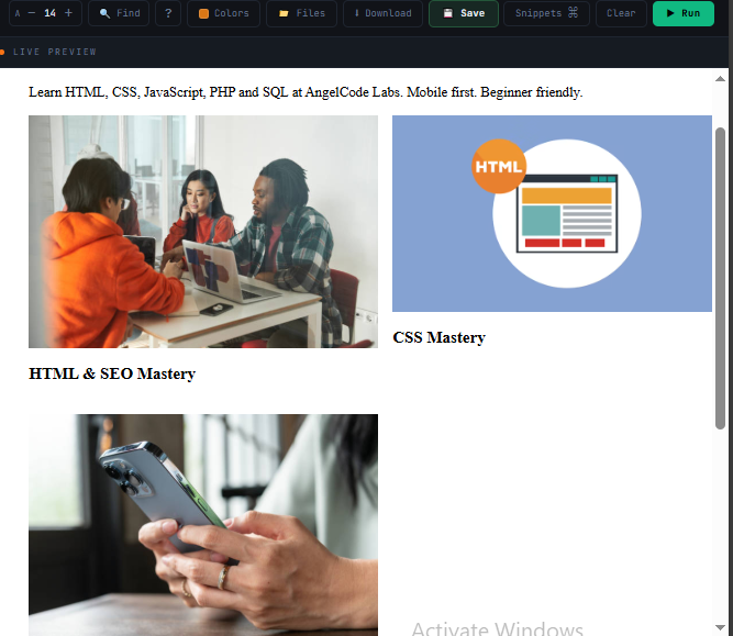
<!-- This is the same AngelCode Labs page from HTML ch8. Add the responsive CSS in a <style> tag and resize your browser to see the layout shift: 1 column → 2 → 3, and padding expand. --> <div class="container"> <!-- Fluid h1: clamp(28px, 5vw, 72px) — from HTML ch12 best practices --> <h1>Web Development Courses in Ghana</h1> <p> Learn HTML, CSS, JavaScript, PHP and SQL at AngelCode Labs. Mobile first. Beginner friendly. </p> <!-- Same course grid as HTML ch6 list — 1 col mobile / 2 tablet / 3 desktop --> <div class="grid"> <div class="card"> <img src="course-html.webp" alt="HTML & SEO Mastery course thumbnail" width="400" height="250" loading="lazy"> <h3>HTML & SEO Mastery</h3> </div> <div class="card"> <img src="course-css.webp" alt="CSS Mastery course thumbnail" width="400" height="250" loading="lazy"> <h3>CSS Mastery</h3> </div> <div class="card"> <img src="course-js.webp" alt="JavaScript Fundamentals course thumbnail" width="400" height="250" loading="lazy"> <h3>JavaScript Fundamentals</h3> </div> </div> <!-- Responsive image — max-width:100%; height:auto (from HTML ch5 best practices) --> <img src="hero.webp" alt="Students learning web development on laptops in Accra" width="1200" height="600" style="margin-top:24px;"> </div>
/* ── Mobile base styles ── */
.container { padding: 0 16px; width: 100%; }
.grid { display: grid; grid-template-columns: 1fr; gap: 16px; }

/* ── Tablet: 768px+ ── */
@media (min-width: 768px) {
  .container { padding: 0 32px; }
  .grid { grid-template-columns: repeat(2, 1fr); }
}

/* ── Desktop: 1200px+ ── */
@media (min-width: 1200px) {
  .container { max-width: 1200px; margin: auto; padding: 0 48px; }
  .grid { grid-template-columns: repeat(3, 1fr); }
}

/* ── Dark mode ── */
@media (prefers-color-scheme: dark) {
  :root { --bg: #0a0a0f; --text: #e8e8f0; }
}

/* ── Accessibility: respect reduced motion ── */
@media (prefers-reduced-motion: reduce) {
  *, *::before, *::after {
    animation-duration: 0.01ms !important;
    transition-duration: 0.01ms !important;
  }
}

/* ── Fluid values — no media queries needed ── */
h1 { font-size: clamp(28px, 5vw, 72px); }
.container { padding-inline: clamp(16px, 5vw, 64px); }

/* ── Responsive images ── */
img { max-width: 100%; height: auto; display: block; }
③ Code Explanation
| Technique | What it does |
|---|---|
| Mobile-first | Base CSS targets the smallest screen — least content, simplest layout. Media queries add to it as screens grow. Results in less CSS overall and better mobile performance. |
| @media (min-width: 768px) | min-width is the mobile-first keyword — "apply these styles when the screen is at least this wide". This adds complexity progressively, the correct direction. |
| prefers-color-scheme: dark | Detects the OS dark mode preference. With CSS variables, you swap colour tokens here and everything updates automatically — no JavaScript, no separate stylesheet. |
| prefers-reduced-motion | Accessibility requirement. Users with vestibular disorders or epilepsy can set this OS preference. Respecting it disables animations and transitions for those users. |
| clamp(28px, 5vw, 72px) | Fluid value with a minimum and maximum. Between those bounds it scales with the viewport. One declaration replaces several media query typography overrides. |
| padding-inline: clamp() | Logical property for left and right padding (in LTR layouts). With clamp it creates proportional padding at every screen size — a professional container pattern. |
| max-width: 100% on img | Prevents images from overflowing their container on small screens. Essential in every CSS reset. height: auto preserves the original aspect ratio. |
④ What You Will See
Transitions & Transforms
Transitions smoothly animate property changes between two states. Transforms move, scale, and rotate elements visually. Combined, they produce the polished hover effects users expect from professional interfaces.
① Explanation
A transition watches a CSS property and animates it when it changes. The transition is defined on the element's default state — not on the :hover — so both entering and leaving the state animate smoothly. A transform moves or reshapes an element visually without affecting layout. Because transforms are GPU-accelerated, they are the best properties to animate — always prefer transform over animating top, left, width, or height.
② Code Example
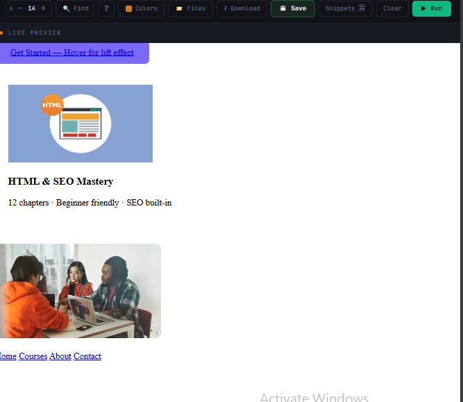
<!-- These are the exact elements from the HTML course. Apply the transition CSS in a <style> tag, then hover each one. --> <!-- "Get Started" / "Enroll" button from HTML ch8 nav: lifts + colour on hover --> <a href="/enroll" class="btn">Get Started — Hover for lift effect</a> <!-- Course card: rises with shadow on hover (the .card from HTML ch8) --> <div class="card" style="max-width:300px; padding:24px; margin:24px 0;"> <img src="course-html.webp" alt="HTML & SEO Mastery course thumbnail" width="260" height="140" loading="lazy"> <h3>HTML & SEO Mastery</h3> <p>12 chapters · Beginner friendly · SEO built-in</p> </div> <!-- Course thumbnail image zoom on hover (from HTML ch5 images section) --> <div style="width:300px; height:170px; overflow:hidden; border-radius:10px; margin:24px 0;"> <img src="course-css.webp" alt="CSS Mastery course thumbnail" width="300" height="170" loading="lazy" style="width:100%; height:100%; object-fit:cover; transition:transform 0.4s ease; display:block;" onmouseover="this.style.transform='scale(1.08)'" onmouseout="this.style.transform='scale(1)'"> </div> <!-- Nav links with animated underline (from HTML ch8 nav structure) --> <nav aria-label="Main navigation"> <a href="/" class="nav-link">Home</a> <a href="/courses" class="nav-link">Courses</a> <a href="/about" class="nav-link">About</a> <a href="/contact" class="nav-link">Contact</a> </nav>
/* ── Transition on default state (both directions animate) ── */
.btn {
  background: #7c6af7;
  padding: 12px 28px;
  border-radius: 8px;
  cursor: pointer;
  transition: background 0.2s ease, transform 0.15s ease, box-shadow 0.2s ease;
}
.btn:hover  { background: #6a58e0; transform: translateY(-2px); box-shadow: 0 8px 24px rgba(124,106,247,.4); }
.btn:active { transform: translateY(0); }  /* press down on click */

/* ── Card lift ── */
.card { transition: transform 0.25s ease, box-shadow 0.25s ease; }
.card:hover { transform: translateY(-6px); box-shadow: 0 20px 40px rgba(0,0,0,.3); }

/* ── Transform functions ── */
.el {
  transform: translateX(20px);        /* move right */
  transform: translateY(-10px);       /* move up */
  transform: scale(1.1);              /* 10% bigger */
  transform: rotate(45deg);           /* rotate */
  transform: translateY(-4px) scale(1.05);  /* combine */
}

/* ── Timing functions ── */
.smooth  { transition: all 0.3s ease; }
.spring  { transition: all 0.3s cubic-bezier(.175,.885,.32,1.275); }
.linear  { transition: all 0.3s linear; }

/* ── Animated underline on links ── */
.link { position: relative; text-decoration: none; }
.link::after {
  content: ""; position: absolute;
  bottom: -2px; left: 0;
  width: 0; height: 2px;
  background: currentColor;
  transition: width 0.3s ease;
}
.link:hover::after { width: 100%; }
③ Code Explanation
| Technique | What it does |
|---|---|
| transition on default state | If you put transition only on :hover, the animation plays entering hover but snaps back instantly on leave. On the default state, both directions animate smoothly. |
| Specific properties | background 0.2s ease, transform 0.15s ease is better than transition: all — it gives each property its own duration and prevents accidental animation of properties you did not intend. |
| transform: translateY(-2px) | Moves element up 2px without triggering layout recalculation — GPU-handled. Always use transform instead of animating top/bottom/left/right which trigger expensive layout reflow. |
| transform: scale(1.1) | Scales from the element's centre. 10% bigger. Does not affect surrounding layout — neighbouring elements do not move. Always prefer over animating width/height. |
| cubic-bezier(.175,.885,.32,1.275) | Custom easing that overshoots slightly and snaps back — the spring/bounce effect. Use cubic-bezier.com to create and preview custom curves. |
| Animated underline | ::after creates a zero-width underline that grows to 100% on hover. The transition animates the width change. currentColor inherits the link's text colour automatically. |
| .btn:active | Resets the translateY on click — user sees the button lift on hover then press down on click. Creates tactile, physical-feeling feedback. |
④ What You Will See
Only animate transform and opacity — the browser handles these on the GPU without layout recalculation. Avoid animating width, height, top, left, margin or padding — they trigger expensive layout reflow on every frame.
CSS Animations
Animations run continuously or on load — they do not need a trigger. They use @keyframes to define stages of movement, powering loading spinners, entrance effects, pulsing notifications, and skeleton loaders.
① Explanation
Every animation has two parts: @keyframes (the sequence of CSS values over time) and the animation property (which applies the keyframes and controls duration, repetition, and fill mode). For performance, animate only transform and opacity. Always include a prefers-reduced-motion override for accessibility.
② Code Example
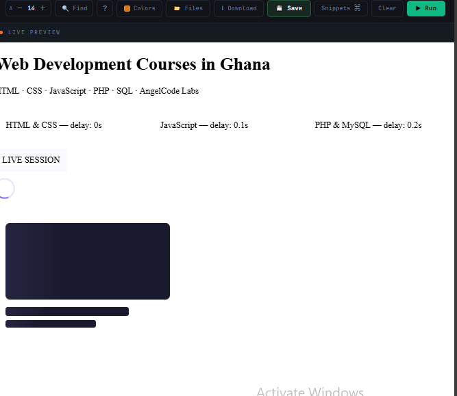
<!-- The exact AngelCode page elements from the HTML course. Apply the @keyframes animation CSS in a <style> tag and reload the page to see the entrance animations fire. --> <!-- Hero h1 fades up on page load: from HTML ch12 best practices CSS: .hero-title { animation: fadeUp 0.6s ease-out forwards; opacity:0 } --> <h1 class="hero-title">Web Development Courses in Ghana</h1> <p class="hero-title" style="animation-delay:0.15s;"> HTML · CSS · JavaScript · PHP · SQL · AngelCode Labs </p> <!-- Staggered course cards: fade in 0.1s apart (from HTML ch6 course list) Same courses as the HTML & CSS, PHP & SQL from the pricing table --> <div style="display:flex; gap:16px; flex-wrap:wrap; margin:24px 0;"> <div class="card" style="flex:1; min-width:140px; padding:20px;"> HTML & CSS — delay: 0s </div> <div class="card" style="flex:1; min-width:140px; padding:20px;"> JavaScript — delay: 0.1s </div> <div class="card" style="flex:1; min-width:140px; padding:20px;"> PHP & MySQL — delay: 0.2s </div> </div> <!-- Live badge: pulsing "LIVE" indicator for a live session feature --> <span class="badge-live">● LIVE SESSION</span> <!-- Loading spinner: shown while the course video thumbnail loads --> <div class="spinner" style="margin:24px 0;" aria-label="Loading course content" role="status"></div> <!-- Skeleton loader: placeholder for a course card while data is fetched (Same shape as the .card with course-thumbnail + title + description) --> <div style="max-width:300px; padding:20px; margin:24px 0;"> <div class="skeleton" style="width:100%; height:140px; border-radius:8px;"></div> <div class="skeleton" style="width:75%; height:16px; border-radius:4px; margin-top:14px;"></div> <div class="skeleton" style="width:55%; height:14px; border-radius:4px; margin-top:8px;"></div> </div>
/* ── Fade-up entrance animation ── */
@keyframes fadeUp {
  from { opacity: 0; transform: translateY(24px); }
  to   { opacity: 1; transform: translateY(0); }
}

.hero-title {
  animation: fadeUp 0.6s ease-out forwards;
  opacity: 0;  /* start invisible before animation runs */
}

/* ── Staggered cards ── */
.card              { animation: fadeUp 0.5s ease-out forwards; opacity: 0; }
.card:nth-child(1) { animation-delay: 0s; }
.card:nth-child(2) { animation-delay: 0.1s; }
.card:nth-child(3) { animation-delay: 0.2s; }

/* ── Pulse: notification dot ── */
@keyframes pulse {
  0%,100% { transform: scale(1); box-shadow: 0 0 0 0 rgba(124,106,247,.4); }
  50%     { transform: scale(1.05); box-shadow: 0 0 0 14px rgba(124,106,247,0); }
}
.badge-live { animation: pulse 2s ease-in-out infinite; }

/* ── Loading spinner ── */
@keyframes spin { to { transform: rotate(360deg); } }
.spinner {
  width: 32px; height: 32px;
  border: 3px solid rgba(124,106,247,.2);
  border-top-color: #7c6af7;
  border-radius: 50%;
  animation: spin 0.8s linear infinite;
}

/* ── Skeleton loader shimmer ── */
@keyframes shimmer {
  from { background-position: -200% 0; }
  to   { background-position:  200% 0; }
}
.skeleton {
  background: linear-gradient(90deg, #1a1a2e 25%, #2a2a4a 50%, #1a1a2e 75%);
  background-size: 200% 100%;
  animation: shimmer 1.5s infinite;
  border-radius: 4px;
}

/* ── Accessibility: always include this ── */
@media (prefers-reduced-motion: reduce) {
  *, *::before, *::after { animation-duration: 0.01ms !important; }
}
③ Code Explanation
| Concept | What it does |
|---|---|
| @keyframes fadeUp { } | Defines the animation sequence. The name (fadeUp) is what you reference in animation. Use from/to for two stages, percentages (0% 50% 100%) for multi-stage sequences. |
| animation: fadeUp 0.6s ease-out forwards | Name, duration, timing, fill-mode. forwards keeps the element in the final keyframe state after the animation ends — without it, the element snaps back to its original state. |
| opacity: 0 on the element | The element starts invisible in its default state. The animation fades it in. Without this, the element flashes visible for one frame before the animation starts. |
| animation-delay per child | Creates a cascade effect. All cards run the same animation but each starts 0.1s later. The user sees a wave-like entrance. Powerful visual effect with just one extra property per child. |
| infinite iteration | Repeats the animation forever. Use for spinners, pulsing notifications, and decorative effects. Replace with a number to run a fixed number of times. |
| Spinner technique | A circle where only border-top-color is fully opaque — the rest is nearly transparent. The spin rotation makes the coloured arc chase itself around. Classic loading indicator requiring just 5 properties. |
| Shimmer skeleton | A gradient that moves across the element horizontally. Simulates content loading. Used by Facebook, YouTube, LinkedIn. The gradient needs background-size: 200% so there is room to slide. |
④ What You Will See
CSS Custom Properties (Variables)
CSS variables store values and make them reusable everywhere. They update live in the browser, can be scoped to components, and enable dark mode and theming with zero JavaScript.
① Explanation
CSS variables are declared with two dashes: --variable-name: value. Declared on :root, they are global. Used with var(--name). Unlike Sass variables, they are reactive — change a variable and every element using it updates instantly. The key professional use is design tokens — named variables for every colour, spacing value, and radius — so changing a design requires updating the token, not hunting down every usage.
② Code Example
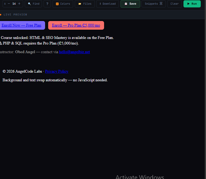
<!-- Apply CSS variables (design tokens) to real AngelCode elements. Change --color-primary in :root and watch every element update at once. --> <!-- Enrollment buttons: use --color-primary and --space tokens From HTML ch8 nav "Get Started" CTA --> <div style="display:flex; gap:12px; flex-wrap:wrap; margin-bottom:24px;"> <a href="/enroll" class="btn">Enroll Now — Free Plan</a> <a href="/enroll-pro" class="btn" style="--color-primary: var(--color-danger, #f7706a);"> Enroll — Pro Plan ₵5,000/mo </a> </div> <!-- Alert boxes using component-scoped --alert-color These match the info-box style from the HTML course --> <div class="alert"> ℹ Course unlocked: HTML & SEO Mastery is available on the Free Plan. </div> <div class="alert danger"> ⚠ PHP & SQL requires the Pro Plan (₵5,000/mo). </div> <!-- var() with fallback: --custom-color not defined, falls back to --muted --> <p class="el"> Instructor: <strong>Obed Angel</strong> — contact via <a href="mailto:hello@angelbiz.net">hello@angelbiz.net</a> </p> <!-- Dark / light mode: the body background and text swap with prefers-color-scheme This is exactly the best practice covered in HTML ch12 --> <div style="padding:20px; background:var(--color-bg, #0a0a0f); color:var(--color-text, #e8e8f0); border-radius:8px; margin-top:24px;"> <p>© 2026 AngelCode Labs · <a href="/privacy">Privacy Policy</a></p> <p>Background and text swap automatically — no JavaScript needed.</p> </div>
/* ── Global design tokens on :root ── */
:root {
  --color-primary:   #7c6af7;
  --color-secondary: #5af7c0;
  --color-danger:    #f7706a;
  --color-bg:        #0a0a0f;
  --color-text:      #e8e8f0;
  --space-sm: 8px;  --space-md: 16px;  --space-lg: 32px;
  --radius: 8px;
  --shadow: 0 4px 24px rgba(0,0,0,.3);
}

/* ── Light mode: swap tokens only ── */
@media (prefers-color-scheme: light) {
  :root { --color-bg: #fff; --color-text: #111; }
}

/* ── Use variables throughout ── */
body { background: var(--color-bg); color: var(--color-text); }
.btn {
  background: var(--color-primary);
  padding: var(--space-sm) var(--space-md);
  border-radius: var(--radius);
}

/* ── Component-scoped override ── */
.alert        { --alert-color: var(--color-primary); border-left: 4px solid var(--alert-color); }
.alert.danger { --alert-color: var(--color-danger); }  /* override for variant */

/* ── var() with fallback ── */
.el { color: var(--custom-color, #888); }  /* uses #888 if --custom-color unset */

/* ── JavaScript: read and write at runtime ── */
/* const r = document.documentElement;                         */
/* r.style.setProperty('--color-primary', '#f7706a');          */
/* getComputedStyle(r).getPropertyValue('--color-primary');    */
③ Code Explanation
| Concept | What it does |
|---|---|
| :root { --name: value; } | :root is the document's root element — higher specificity than html. Variables declared here are available globally to every element and selector in the stylesheet. |
| var(--name) | Reads the variable. If the variable is not defined, the property is treated as invalid. Always provide a fallback for optional variables: var(--custom, defaultValue). |
| Design tokens | Naming variables semantically (--color-primary not --purple) decouples meaning from value. When you rebrand, you change the values once in :root — every button, link, and border updates automatically. |
| Dark mode token swap | Only colour tokens change for dark mode — primary colour, radius, spacing stay the same. All components using var() update automatically. No duplicate ruleset, no extra stylesheet. |
| Component-scoped override | CSS variables inherit down the DOM. Redefining --alert-color on .alert.danger only affects that element and its children — clean variant pattern with no extra class names on children. |
| JS integration | setProperty() writes CSS variables from JS. getComputedStyle().getPropertyValue() reads them. This bridges CSS theming and JavaScript logic — live theme pickers, user preferences, dynamic data-driven styles. |
④ What You Will See
Purple Theme
#7c6af7
Green Theme
#5af7c0
Red Theme
#f7706a
Pseudo-Classes & Pseudo-Elements
Pseudo-classes target elements by state or structural position. Pseudo-elements create virtual sub-elements for styling. Together they eliminate extra HTML and enable effects that would otherwise require JavaScript.
① Explanation
Pseudo-classes (single colon) target state — :hover, :focus, :checked — or position in the DOM — :first-child, :nth-child(). Pseudo-elements (double colon) insert virtual content — ::before and ::after require content: "" to appear. Never remove :focus styles without providing an alternative — keyboard users depend on them.
② Code Example
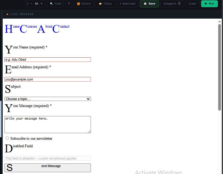
<!-- These are the real elements from the HTML course chapters 6 and 7. Apply the pseudo-class / pseudo-element CSS in a <style> tag. --> <!-- Nav links with :hover and animated ::after underline The same nav structure from HTML ch8 (aria-label, ul > li > a) --> <nav aria-label="Main navigation" style="display:flex; gap:0; margin-bottom:32px;"> <ul style="display:flex; gap:0; list-style:none; padding:0;"> <li><a href="/" class="nav-link">Home</a></li> <li><a href="/courses" class="nav-link" aria-current="page">Courses</a></li> <li><a href="/about" class="nav-link">About</a></li> <li><a href="/contact" class="nav-link">Contact</a></li> </ul> </nav> <!-- Contact form from HTML ch7: :focus-visible on inputs (tab through to see the accessible outline) :valid / :invalid (type an invalid email to trigger red border) input:disabled (opacity:.5; cursor:not-allowed) .required::after inserts the red asterisk * --> <form action="/send-message" method="POST" style="display:flex; flex-direction:column; gap:12px; max-width:360px; margin-bottom:32px;"> <label for="name">Your Name <span class="required">(required)</span></label> <input type="text" id="name" name="name" placeholder="e.g. Adu Obed" required> <label for="email">Email Address <span class="required">(required)</span></label> <input type="email" id="email" name="email" placeholder="you@example.com" required> <label for="subject">Subject</label> <select id="subject" name="subject"> <option value="">Choose a topic…</option> <option value="courses">Course Questions</option> <option value="billing">Billing</option> <option value="other">Other</option> </select> <label for="message">Your Message <span class="required">(required)</span></label> <textarea id="message" name="message" rows="4" placeholder="Write your message here…" required></textarea> <label> <input type="checkbox" name="newsletter" value="yes"> Subscribe to our newsletter </label> <label for="disabled-field">Disabled Field</label> <input type="text" id="disabled-field" disabled placeholder="This field is disabled — cursor:not-allowed applies"> <button type="submit">Send Message</button> </form> <!-- Course pricing table from HTML ch6 — :nth-child(even) zebra stripes :first-child removes top border, :last-child removes bottom border --> <table style="border-collapse:collapse; width:100%; max-width:480px;"> <caption>Course Pricing Plans — AngelCode Labs</caption> <thead> <tr> <th scope="col">Feature</th> <th scope="col">Free Plan</th> <th scope="col">Pro Plan</th> </tr> </thead> <tbody> <tr><td>HTML & CSS Courses</td><td>✓</td><td>✓</td></tr> <tr><td>JavaScript Fundamentals</td><td>✓</td><td>✓</td></tr> <tr><td>PHP & SQL Courses</td><td>✗</td><td>✓</td></tr> <tr><td>Project Reviews</td><td>✗</td><td>✓</td></tr> </tbody> <tfoot> <tr><td>Price</td><td>Free</td><td>₵5,000/mo</td></tr> </tfoot> </table> <!-- ::first-letter drop cap on the article from HTML ch8 --> <article style="max-width:520px; margin-top:32px;"> <p> Once you have learned HTML structure, semantic layout, and forms, the next step is CSS — the language that transforms a bare document into a polished, responsive web page. This is exactly what the CSS Mastery course covers. </p> </article> <!-- ::marker colours the bullets in the course feature list (HTML ch6 ul) --> <ul style="margin-top:16px;"> <li>HTML & CSS Courses — Free Plan</li> <li>PHP & SQL — Pro Plan only</li> <li>Project Reviews — Pro Plan only</li> </ul>
/* ── State pseudo-classes ── */
a:hover          { color: var(--accent); }
a:focus-visible  { outline: 2px solid var(--accent); outline-offset: 4px; }
input:valid      { border-color: #5af7c0; }
input:invalid    { border-color: #f7706a; }
input:disabled   { opacity: .5; cursor: not-allowed; }

/* ── Structural ── */
li:first-child        { border-top: none; }
li:last-child         { border-bottom: none; }
tr:nth-child(even)    { background: rgba(255,255,255,.03); }
p:not(:last-child)   { margin-bottom: 16px; }
section:has(> h2)    { padding-top: 48px; }  /* modern parent selector */

/* ── ::before and ::after ── */
.required::after { content: " *"; color: var(--accent2); }

/* ── Animated underline via ::after ── */
.nav-link { position: relative; text-decoration: none; }
.nav-link::after {
  content: ""; position: absolute;
  bottom: -2px; left: 0; width: 0; height: 2px;
  background: var(--accent);
  transition: width 0.3s ease;
}
.nav-link:hover::after { width: 100%; }

/* ── Other pseudo-elements ── */
::selection    { background: rgba(124,106,247,.4); }
::placeholder  { color: var(--muted); font-style: italic; }
::first-letter { font-size: 3em; float: left; line-height: .8; }
::marker       { color: var(--accent); }
③ Code Explanation
| Pseudo | What it does |
|---|---|
| :hover | Applies when pointer is over the element. Most-used pseudo-class — button colours, card lifts, nav highlights. |
| :focus-visible | Shows focus indicator only on keyboard navigation (not mouse clicks). Better than :focus. Never suppress without replacement — keyboard users rely on it to know where they are. |
| :valid / :invalid | Browser applies these based on HTML validation attributes (required, type="email", pattern). Use for automatic form feedback without JavaScript. |
| :nth-child(even) | Targets every even-numbered child. Classic use: zebra-stripe table rows. :nth-child(3n+1) targets every third item starting at 1 — useful for grid accents. |
| :not(selector) | Matches everything that does NOT match the selector. p:not(:last-child) adds margin to all paragraphs except the last — eliminating a margin-reset class. |
| :has() | The "parent selector" CSS has needed for decades. section:has(> h2) targets sections containing a direct h2 child. Supported in all modern browsers since 2023. |
| ::before / ::after | Virtual first/last child. Require content: "" (even empty). Position absolutely relative to parent (needs position: relative). Used for decorative icons, badges, animated underlines. |
| ::selection | Styles the text highlight when users select text. Apply a brand colour to make even selection feel polished. |
| ::marker | Styles list bullets and numbers directly — no more list-style: none + padding hacks just to colour a bullet. |
④ What You Will See
CSS Architecture & Best Practices
Writing CSS that works is one thing. Writing CSS that remains maintainable six months later is another. This chapter covers the professional systems that separate experienced developers from beginners.
① Explanation
Large projects need structure. Without it, CSS becomes a mess of overrides, !important declarations, and mystery specificity battles. Three tools solve this: BEM naming makes class names self-documenting and predictable. Design tokens via CSS variables centralise all values so changing a colour updates everything. Logical file organisation separates concerns: reset → tokens → base → components → utilities.
② Code Example
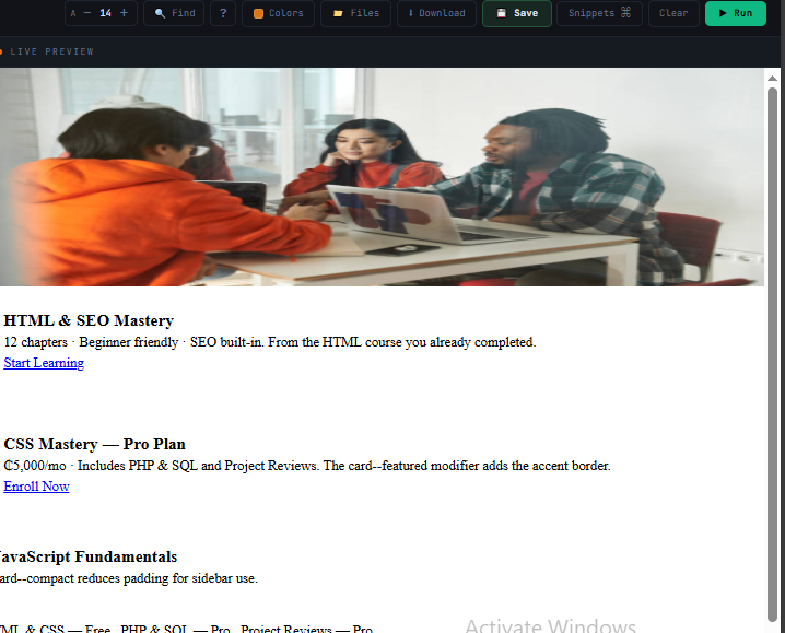
<!-- The AngelCode course card — restructured using BEM naming. Notice how class names alone describe the structure perfectly. --> <!-- BEM Block: .card — the standard course card from HTML ch8 --> <div class="card"> <img class="card__image" src="course-html.webp" alt="HTML & SEO Mastery course thumbnail" width="400" height="250" loading="lazy"> <div class="card__body"> <h3 class="card__title">HTML & SEO Mastery</h3> <p class="card__description"> 12 chapters · Beginner friendly · SEO built-in. From the HTML course you already completed. </p> <a href="/courses/html" class="card__cta">Start Learning</a> </div> </div> <!-- BEM Modifier: .card--featured — the Pro Plan course card From HTML ch6 pricing: Pro Plan includes PHP & SQL & Project Reviews Note: base class .card is ALWAYS present alongside the modifier --> <div class="card card--featured" style="margin-top:16px;"> <div class="card__body"> <h3 class="card__title">CSS Mastery — Pro Plan</h3> <p class="card__description"> ₵5,000/mo · Includes PHP & SQL and Project Reviews. The card--featured modifier adds the accent border. </p> <a href="/courses/css" class="card__cta">Enroll Now</a> </div> </div> <!-- BEM Modifier: .card--compact — sidebar card in the article layout from HTML ch8 --> <div class="card card--compact" style="margin-top:16px;"> <div class="card__body"> <h3 class="card__title">JavaScript Fundamentals</h3> <p class="card__description">card--compact reduces padding for sidebar use.</p> </div> </div> <!-- Utility classes on the course grid (from HTML ch6 course listing) --> <div class="flex" style="gap:12px; flex-wrap:wrap; margin-top:24px;"> <span class="badge">HTML & CSS — Free</span> <span class="badge">PHP & SQL — Pro</span> <span class="badge">Project Reviews — Pro</span> </div> <!-- .sr-only: screen-reader label on the enroll icon button (accessibility) --> <button> <span class="sr-only">Enroll in CSS Mastery — Pro Plan</span> ★ </button>
/* ── Modern CSS Reset (start every project with this) ── */
*, *::before, *::after      { box-sizing: border-box; margin: 0; padding: 0; }
html                         { scroll-behavior: smooth; }
body                         { line-height: 1.5; -webkit-font-smoothing: antialiased; }
img, picture, video, canvas { display: block; max-width: 100%; }
input, button, textarea      { font: inherit; }
p, h1, h2, h3               { overflow-wrap: break-word; }

/* ── BEM: Block__Element--Modifier ── */
.card                 { background: var(--card); border-radius: var(--radius); }
.card__image          { width: 100%; }         /* element */
.card__body           { padding: 24px; }        /* element */
.card__title          { font-size: 1.2rem; }   /* element */
.card--featured       { border: 2px solid var(--accent); }  /* modifier */
.card--compact .card__body { padding: 12px; }  /* modifier affects element */

/* ── Utility classes ── */
.flex    { display: flex; }
.grid    { display: grid; }
.hidden  { display: none; }
.sr-only {             /* visually hidden but readable by screen readers */
  position: absolute; width: 1px; height: 1px;
  padding: 0; margin: -1px; overflow: hidden;
  clip: rect(0,0,0,0); white-space: nowrap; border: 0;
}

/* ── Cascade Layers: explicit priority control ── */
@layer reset, base, components, utilities;
@layer reset      { * { box-sizing: border-box; } }
@layer base       { body { font-family: var(--font-body); } }
@layer components { .btn { padding: 10px 20px; } }
@layer utilities  { .hidden { display: none; } } /* always wins */
③ Code Explanation
| Concept | What it does |
|---|---|
| Modern reset | Removes browser default margin/padding, fixes box-sizing globally, makes images block-level (removes the gap underneath), and makes form elements inherit font — the most common annoyances in one block. Start every project with this. |
| BEM Block | A standalone, reusable component (.card). All styles for the component live under this class. No dependence on location in the page — a card is a card wherever it appears. |
| BEM Element (double underscore) | A part of the block that has no meaning outside it (.card__title). Never nest BEM elements — .card__body__title is wrong. Keep it flat: .card__title. |
| BEM Modifier (double dash) | A variant of a block or element (.card--featured). Applied in addition to the base class, never instead of it: class="card card--featured". The base styles stay, the modifier overrides specific properties. |
| .sr-only utility | Visually hides an element but keeps it in the accessibility tree. Screen readers still read it. Used for skip links, icon button labels, and section headings that exist for accessibility but would clutter the visual design. |
| @layer | Modern CSS cascade layers explicitly define priority. Utilities always beat components, components beat base, base beats reset — regardless of specificity. Eliminates the specificity wars that plague large CSS codebases. |
④ What You Will See
styles/reset.css → styles/tokens.css (variables) → styles/base.css (body, typography) → styles/components/ (button.css, card.css, nav.css) → styles/pages/ (home.css, course.css) → styles/utilities.css. Import them in this order in your main CSS file.
Element, class, ID, combinators, attribute selectors — and specificity scoring.
box-sizing: border-box. Content, padding, border, margin. Display types.
rem units, unitless line-height, clamp() for fluid sizes, gradient text.
justify-content, align-items, gap, flex shorthand, margin-left: auto.
auto-fit minmax, named areas, grid-area, span, place-items.
relative+absolute, sticky nav, fixed modal, inset, transform centering.
Mobile-first, min-width queries, prefers-color-scheme, clamp().
transition on default state, GPU-safe properties, cubic-bezier easing.
@keyframes, forwards fill, stagger delays, spinner, shimmer skeleton.
Design tokens, dark mode swap, component scoping, JS integration.
:hover :focus-visible :nth-child :has() :: before ::after ::selection.
Modern reset, BEM naming, sr-only, @layer cascade control.